4. Start with mobile first design
If we start a design on the desktop version, content will have to be adapted later to fit on a smaller screen. This retrofitting could make the user experience worse and increase the environmental footprint if content is loaded unnecessarily.
The mobile first approach, allows you to get to the point, remove unnecessary capabilities and content, and ensures that your service works properly on mobile devices. Of course, it doesn’t mean that your design completely ignores the desktop version.
“The mobile first approach must be designed for low-power mobile terminals with a low bandwidth (3G rather than 4G for example). These technical constraints forces designers to focus on the essential and to design a simple and digital service with a reduced impact.” (Translated from the French)
Questions to ask yourself
- What is essential?
- What is the minimum technology needed to solve the problem?
- Does it work on mobile and desktop?
- Are the buttons and text fields suitable for mobile?
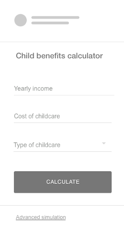
Example of mobile first wireframe
Functional unit: Simulate child benefits
For a simulation service, you might be tempted to ask for a lot of information that would slow the experience down, and could discourage users because they don’t have all the information at hand.
The mobile first approach shows all the necessary information for a first-level simulation. We can provide an advanced option if users want to go further.
This way we provide an accessible service on mobile, and a simple and smooth experience.